Museum App Design

Designing a seamless platform for discovering art and planning museum visits.

Museum App Design

Designing a seamless platform for discovering art and planning museum visits.

Role: UX/UI Designer ·
Tools: Figma, FigJam, Usability Testing
Timeline: 8 weeks - 2025

Overview

This project explored how UX design can improve how people discover art, plan museum visits, and engage with cultural content. Many museum platforms still rely on outdated interfaces, slow loading experiences, and limited digital planning tools.

As a result, users struggle to explore exhibits, organize visits, and access information efficiently. The goal of this project was to design a modern, user-centered platform that simplifies art discovery and makes planning museum visits easier and more engaging.

The Problem

Young professionals often visit museums after work or on weekends, yet many museum platforms create friction in the planning process.

Common issues include:

  • Outdated interfaces and slow loading times
  • Difficulty discovering new exhibits
  • Limited digital tools for planning visits
  • Lack of real-time information such as crowd levels

These issues make it harder for users to explore art and plan visits efficiently.

The Goal

Design a seamless platform that helps users discover art and plan museum visits more efficiently.

  • Key improvements include:
  • Making exhibits and artists easier to discover
  • Providing detailed artwork information
  • Simplifying the visit planning process
  • Adding real-time crowd updates

These improvements aim to create a modern, fast, and intuitive experience.

My Role

As the sole designer on this project, I handled the full UX process from research to final design.

Responsibilities included:

  • Conducted user research and defined key insights
  • Created personas, user journeys, and flows
  • Designed wireframes, prototypes, and mockups
  • Developed low- and high-fidelity visuals
  • Tested and refined designs through user feedback

User Research

To understand how people discover and plan art experiences, I conducted qualitative research through interviews and surveys. The research focused on how users explore exhibits, plan visits, and engage with museum platforms.

Key Insight

Users value speed, clarity, and efficient planning tools more than visually complex interfaces.

Persona

Marcus Thompson

Frontend Developer · NYC

Art is my way to disconnect after work. I want planning a visit to be as smooth as discovering the exhibit.

Traits

Tech-savvy - Visual learner - Art enthusiast

Marcus Thompson

Frontend Developer · NYC

Art is my way to disconnect after work. I want planning a visit to be as smooth as discovering the exhibit.

Traits

Tech-savvy - Visual learner - Art enthusiast

Marcus Thompson

Frontend Developer · NYC

Art is my way to disconnect after work. I want planning a visit to be as smooth as discovering the exhibit.

Traits

Tech-savvy - Visual learner - Art enthusiast

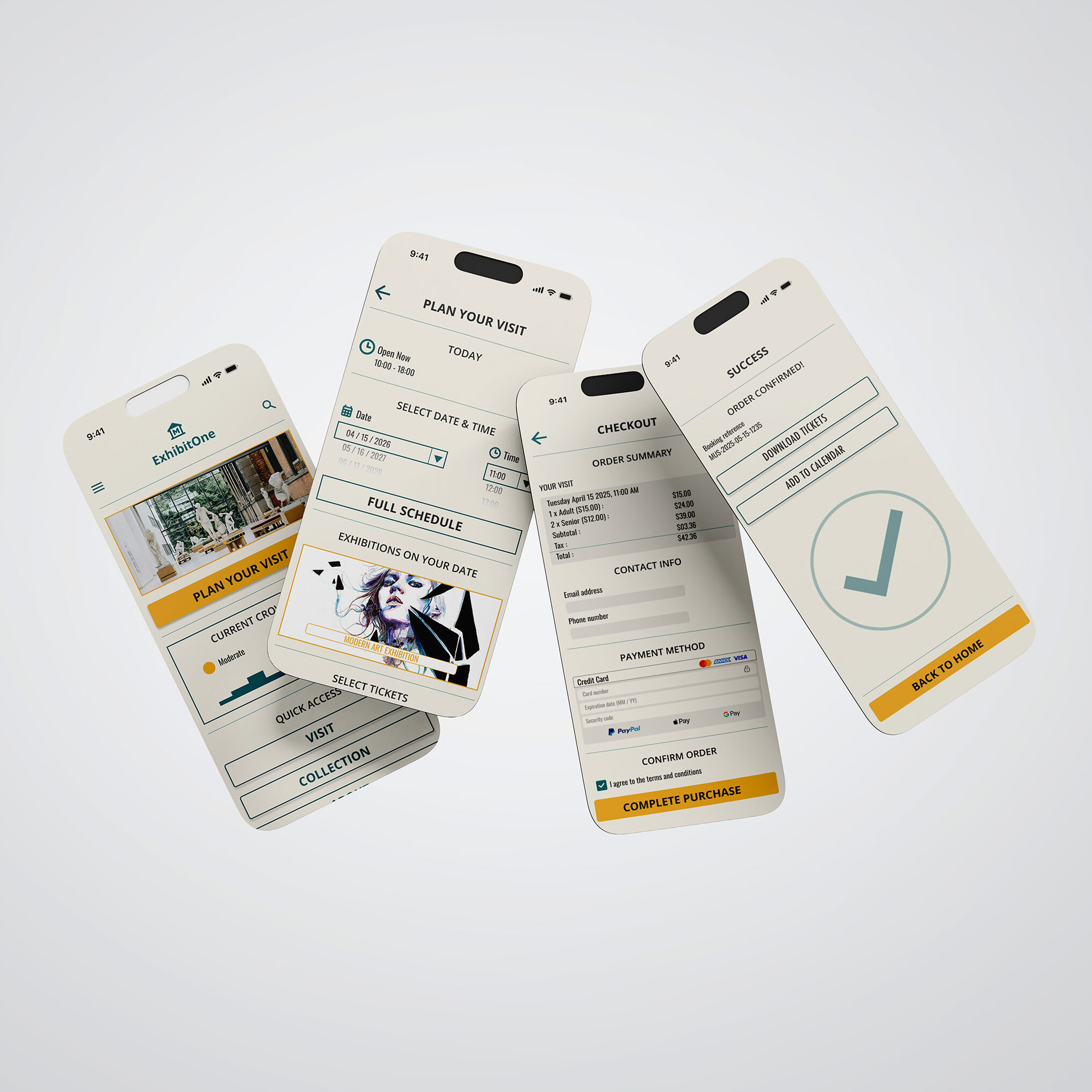
Marcus is a NYC-based frontend developer who enjoys visiting museums and galleries as a way to unwind after work. As someone who works with technology daily, he expects digital experiences to be fast, intuitive, and visually clear.

However, many museum websites feel outdated and difficult to navigate. Slow loading pages, unclear exhibit information, and limited planning tools make it harder for him to explore new exhibitions or organize visits efficiently.

He values:

  • Fast, responsive interfaces that respect his time
  • Clear exhibit information and detailed artwork descriptions
  • Real-time crowd updates to plan comfortable visits
  • Simple booking and modern payment options

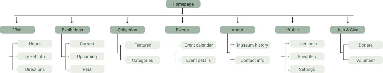
Marcus represents users who rely on efficient digital tools to discover cultural experiences. His needs helped guide design decisions focused on clarity, speed, and streamlined visit planning.

User Journey Map

To better understand how users interact with museum platforms, I mapped the journey of a typical visit—from discovering an exhibit to experiencing it on-site. This helped identify key moments where users encounter friction and where the experience could be improved.

Insights from the journey map highlighted opportunities to simplify visit planning, improve exhibit discovery, and introduce tools such as real-time crowd indicators and streamlined ticket purchasing.

The Design Process

Information Architecture

I mapped the platform structure to simplify navigation and support core tasks such as exhibit discovery and visit planning.

Paper Wireframe

Paper wireframes were sketched to quickly explore layout ideas and user flows before moving into digital design. This stage focused on structure and hierarchy, allowing rapid iteration without the distraction of visual styling.

Low-Fidelity Prototype

I created a low-fidelity prototype from the user flows and wireframes to test core functionality and validate user interactions before developing the final interface.

Usability Testing

Parameters

Study Type

Unmoderated

Location

New York, USA

Participants

5 Participants

Lenght

20-30 minutes

Study Type

Unmoderated

Location

New York, USA

Participants

5 Participants

Lenght

20-30 minutes

Findings

Participants were asked to discover exhibits and plan a museum visit. Testing revealed the original flow required too many steps, causing frustration. To improve usability, I reduced navigation steps, simplified task flows, and introduced a calendar feature to support easier scheduling, resulting in a smoother user experience.

Final Design

Mockup

Based on insights from the usability studies, I made several design improvements to enhance the user experience. This included developing a clearer, more intuitive navigation system and simplifying the user flow to make tasks easier and reduce confusion. These changes helped align the design more closely with user needs and improve overall usability.

High-Fidelity Prototype

Once the low-fidelity prototype was finalized, I moved on to developing the final designs with a focus on improving clarity and ease of navigation. The goal was to create a more intuitive and user-friendly experience throughout the interface.​

Key UX Decisions

Simplified Navigation
Reorganized the information architecture to reduce friction when discovering exhibits.

Calendar Integration
Added scheduling tools to support easier visit planning.

Crowd Indicators
Introduced real-time crowd updates to help users choose optimal visit times.

Clear Content Hierarchy
Structured exhibit information to improve readability and decision-making.

Outcome

  • Improved Exhibit Discovery
    Users can find exhibits more easily through clearer navigation and improved content structure.
  • Faster Visit Planning
    A simplified user flow reduces the steps required to organize a museum visit.
  • Clearer Information Access
    Artwork details and exhibit information are easier to scan and understand.
  • More Intuitive Experience
    Usability testing showed the redesigned interface feels smoother and easier to navigate.

The final design reduces friction in exhibit discovery and visit planning, creating a clearer and more intuitive experience for users exploring cultural spaces online. This project reinforced the importance of using research insights and iterative testing to improve how people discover art and engage with museums through digital platforms.