Skyve Studio Website
Designing a strategy-led digital foundation built on clarity, structure, and long-term scalability.
Role: UX/UI Designer ·
Tools: Figma, WordPress, Elementor
Timeline: 8 weeks - 2024
Skyve Studio Website
Designing a strategy-led digital foundation built on clarity, structure, and long-term scalability.
Role: UX/UI Designer
Tools: Figma, WordPress, Elementor
Timeline: 8 weeks - 2024
Overview
Skyve Studio is a creative studio helping businesses and nonprofits grow through branding, web design, and strategy.
This project focused on building a digital foundation that clearly communicates expertise, establishes credibility, and supports long-term growth, not just visual appeal. The goal was to design a website that reflects strategic thinking through structure, clarity, and intentional user flow.
The Challenge
The website needed to communicate expertise immediately while remaining approachable.
It had to serve multiple decision-makers, reduce cognitive friction, and balance authority without feeling overly corporate. At the same time, the structure needed to support long-term scalability. The risk wasn’t poor design, it was unclear positioning and structural complexity.
Strategic Focus
Once the core challenges were defined, the next step was translating them into structure.
Rather than starting with visuals, I focused on rebuilding the foundation of the experience.
The approach centered on:
- Restructuring the information architecture to improve clarity
- Simplifying navigation pathways to reduce friction
- Defining a clear content hierarchy to guide attention
- Designing intentional section pacing to support decision-making
- Creating a modular layout system for long-term flexibility
Every decision prioritized clarity, usability, and scalability. This was a structure-first process where design supported strategy, not the other way around.
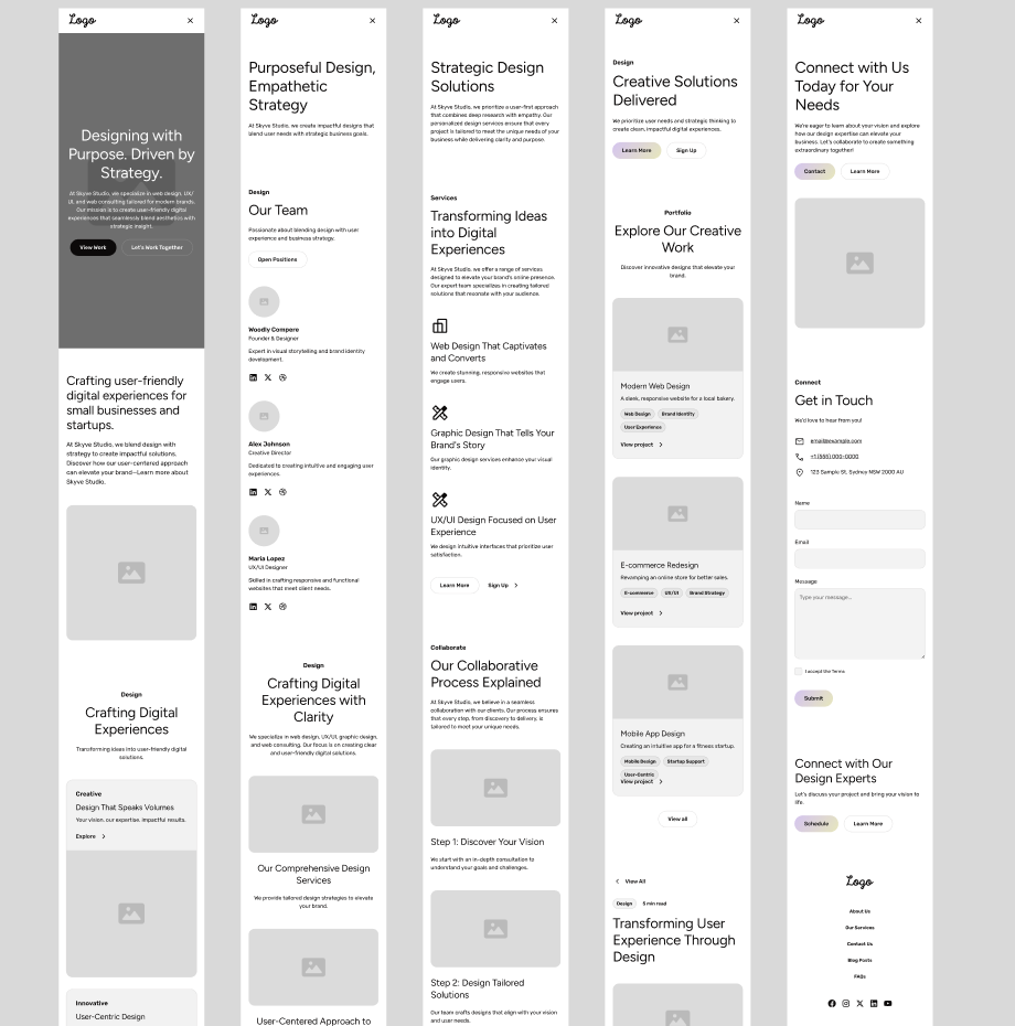
Wireframe structure exploration
Research & Structure
Light qualitative research focused on understanding how business owners evaluate design partners.
Key Insight
Decision-makers value clarity and confidence over visual complexity.
Structural Work Included:
- Created refined personas to clarify client goals and priorities
- Simplified the sitemap to improve navigation flow
- Designed grayscale wireframes (desktop and mobile) to prioritize structure before visuals
- Refined content hierarchy to ensure clarity and logical progression
Design Direction
The visual system supports clarity rather than overpowering it.
Color Palette
#234E70
Primary
#F2BC79
Accent
#FFFFFF
Neutral
#010203
Neutral
#B8C2CC
Neutral
Typography
Headings
Modern sans-serif with strong contrast
Body
Clean geometric sans-serif for readability
UI Styles
Rounded corners, soft shadows, and generous white space to create an approachable yet refined look.
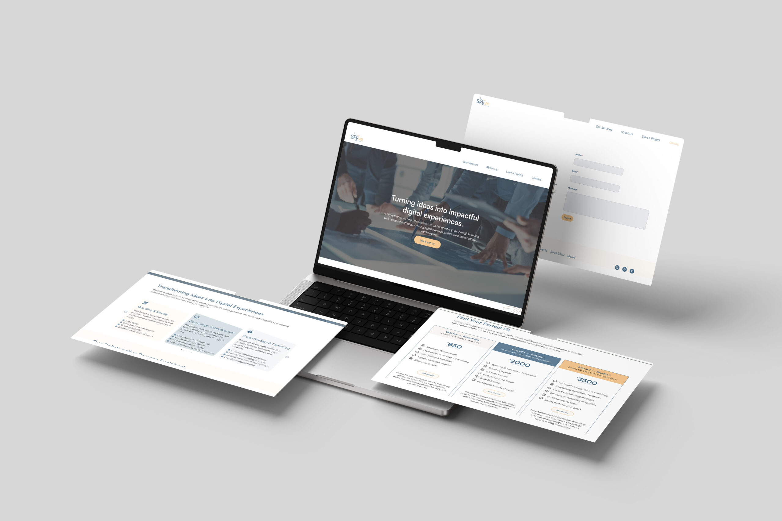
UX Decisions
Navigation Simplification
Reduced menu friction and clarified page grouping.
Section Pacing
Intentional content rhythm guides attention without overwhelm.
Conversion Alignment
Clear CTAs placed at natural decision points.
Responsive Optimization
Designed mobile-first to ensure consistency across breakpoints.
Performance Focus
Lightweight build for improved load speed.
Outcome
- Clearer service positioning
- Increased engagement toward contact inquiries
- Improved navigation flow
- Scalable WordPress system for ongoing growth
Design is not decoration. It is structure.
Clarity builds trust.
Hierarchy guides attention.
Systems support growth.
This project reinforced the importance of intentional UX thinking at every level.