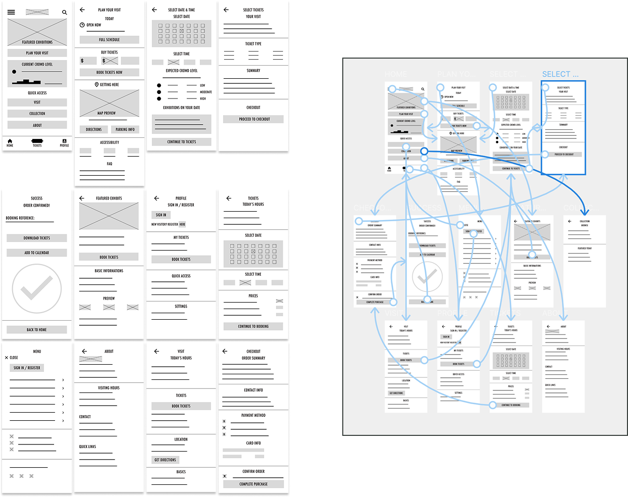
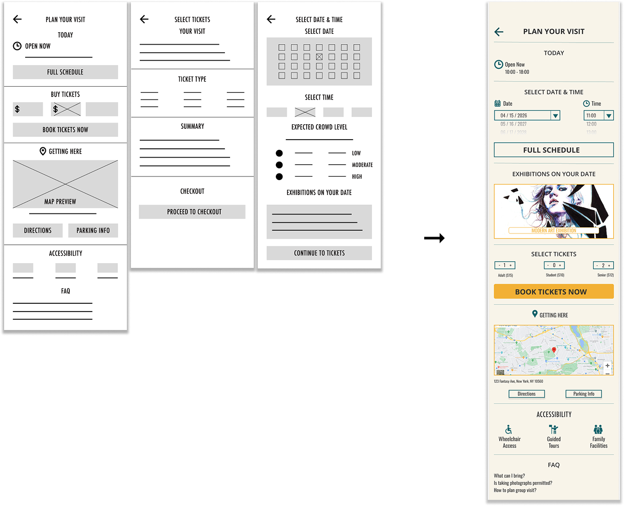
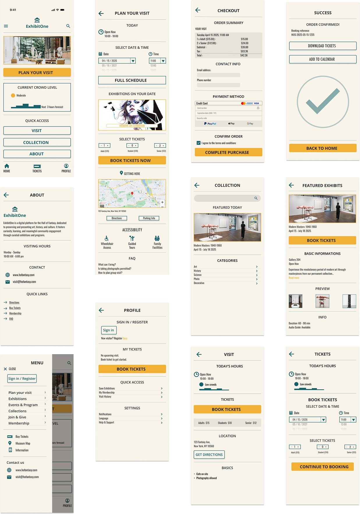
Project overview

Project overview

The Product

A digital platform that helps users discover art, plan museum or gallery visits, and engage with curated content through a smooth, personalized, and informative experience.​

Project Duration

8 weeks; February 2025 - April 2025​

Museum App Design

The Problem

Young professionals who relies on art as their evening escape, need a platform with a seamless digital experience because outdated interfaces, slow loading times, and limited virtual options make it difficult for them to explore art, plan visits, and engage with art content efficiently.

The Goal

Deliver an easy-to-use and engaging platform that allows users to explore art, plan visits, and interact with content effortlessly. The platform will feature fast loading times, personalized recommendations, and real-time crowd updates to enhance the overall experience.

My Role

As the sole designer, I handled all aspects of the user experience, from research to final design, creating an intuitive platform that simplifies art exploration, visit planning, and content engagement.​

Responsabilities

  • Conducted user research and defined key insights
  • Created personas, user journeys, and flows
  • Designed wireframes, prototypes, and mockups
  • Developed low- and high-fidelity visuals
  • Tested and refined designs through user feedback

The user

User Research

Summary

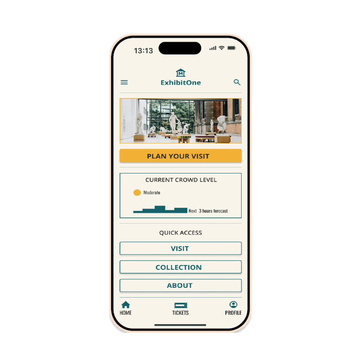
To understand user frustrations, needs, and requirements, I conducted foundational qualitative research through interviews and surveys, focusing on how users plan and engage with arts and cultural spaces. One key insight came from a tech-savvy, visually oriented user who values detailed content, modern interfaces, and efficient planning tools. Their experience highlighted common pain points such as outdated design, slow load times, limited digital resources, and unclear crowd indicators. These findings emphasize the need for streamlined, user-friendly platforms that enhance accessibility, planning, and overall engagement.

Pain Points

Frustrated by outdated user interfaces, slow loading times, and limited virtual tour options.

Finds poor integration with calendar apps and lack of digital payment options inconvenient.​

Struggles with unclear crowd level indicators, making it difficult to plan comfortable visits.​

Persona

Art is my evening escape after coding all day. I need real-time updates and seamless digital experiences that respect my time and enhance my appreciation of art.

Age

Gender

Family Status

Children

Job Title

Income

Education Level

Most used website

29

Male

Single

No

Frontend Developer

$120,000

BS in Computer Science

behance.com

Marcus Thompson

Background​

Marcus is a NYC -based frontend developer passionate about tech and the arts. A visual learner and amateur photographer, he looks for detailed artwork descriptions and ways to support diverse artists. Frustrated by outdated interfaces and slow sites, he values clear crowd indicators, easy payments, and a smooth, modern user experience.

Goals

  • Seeks detailed artwork descriptions and ways to support diverse artists’ exhibitions.
  • Values clear crowd level indicators, easy payment options, and a more streamlined experience.
  • Wants modern user interfaces and fast loading times to enhance the visit planning process.

Pain Points​

  • A lack of modern payment options (like Apple Pay or contactless) creates unnecessary friction.
  • Long load times disrupt his experience and make exploring events or exhibits feel tedious.
  • Poor search and filtering make it hard to find relevant exhibits or plan visits efficiently.

Marcus Thompson

Art is my evening escape after coding all day. I need real-time updates and seamless digital experiences that respect my time and enhance my appreciation of art.

Age

Gender

Family Status

Children

Job Title

Income

Education Level

Most used website

29

Male

Single

No

Frontend Developer

$120,000

BS in Computer Science

behance.com

Marcus Thompson

Background​

Marcus is a NYC -based frontend developer passionate about tech and the arts. A visual learner and amateur photographer, he looks for detailed artwork descriptions and ways to support diverse artists. Frustrated by outdated interfaces and slow sites, he values clear crowd indicators, easy payments, and a smooth, modern user experience.​

Goals

  • Seeks detailed artwork descriptions and ways to support diverse artists’ exhibitions.
  • Values clear crowd level indicators, easy payment options, and a more streamlined experience.
  • Wants modern user interfaces and fast loading times to enhance the visit planning process.

Pain Points​

  • A lack of modern payment options (like Apple Pay or contactless) creates unnecessary friction.
  • Long load times disrupt his experience and make exploring events or exhibits feel tedious.
  • Poor search and filtering make it hard to find relevant exhibits or plan visits efficiently.

User Journey Map

Marcus Thompson​

Marcus is planning a solo visit after work to explore a new exhibit by a diverse artist he discovered online.

The Design Process

Sitemap

I designed user-centered flows to help personas achieve their main goals while addressing existing pain points. The organized layout makes it easier for users to navigate and for search engines to index content, boosting online visibility. By mapping out the site structure early on, I aimed to create a smooth and intuitive user experience.

Paper Wireframe

I designed user-centered flows to help personas achieve their main goals while addressing existing pain points. The organized layout makes it easier for users to navigate and for search engines to index content, boosting online visibility. By mapping out the site structure early on, I aimed to create a smooth and intuitive user experience.

Low-Fidelity Prototype

I developed a low-fidelity prototype based on the user flow diagram and wireframes to test core functionality and ensure it was accessible to end-users before moving forward with the final design.

Usability Study

Parameters

Study Type

Unmoderated

Location

New York, USA

Participants

5 Participants

Lenght

20-30 minutes

Study Type

Unmoderated

Location

New York, USA

Participants

5 Participants

Lenght

20-30 minutes

Findings

User testing revealed that the current flow involved too many clicks, causing frustration and inefficiency. To improve the experience, I reduced the number of steps by simplifying navigation and combining related actions. Based on user feedback, I also added a calendar feature to make scheduling easier and enhance visibility. These changes helped create a smoother, more intuitive user flow.

Refining The Design

Mockup

Based on insights from the usability studies, I made several design improvements to enhance the user experience. This included developing a clearer, more intuitive navigation system and simplifying the user flow to make tasks easier and reduce confusion. These changes helped align the design more closely with user needs and improve overall usability.

High-Fidelity Prototype

Once the low-fidelity prototype was finalized, I moved on to developing the final designs with a focus on improving clarity and ease of navigation. The goal was to create a more intuitive and user-friendly experience throughout the interface.​

Take Away

Impact& Results

This project aimed to solve common user pain points and explore how UX design affects behavior and emotions. Through user research, testing, and iterative improvements, I identified key areas where design could reduce friction and enhance engagement. The final solution led to a more intuitive experience, improved task completion, and higher user satisfaction—highlighting the meaningful impact of thoughtful UX design on both user outcomes and emotional response.